Big Screen
How to design for a 48 inch display in-vehicle experience.
After one look at Byton’s sprawling 48” display, people’s next question is always “how do you design for that?” Their concern is mainly around driver distraction. I’d like to refer to David’s post which covers a lot about the position of the screen and other safety related aspects. For now, let’s focus on the digital user experience and interaction models.
After the global dismiss time, all open apps enter the decluttered ‘hero’ state. In the ‘hero state’ the content in ‘focus’ is either centered, augmented, or magnified. For instance, in the media application, the song currently playing will switch to hero state after the global timeout. In this case, the playlist will be hidden and the cover artwork or radio station logo will be centered. This declutters the screen, minimizes distraction and highlights the selected content. To exit hero state, the user needs to interact with the application/feature via voice, touch, hand gesture or gaze.
Our interaction models take advantage of muscle memory making it easy to use. Going further, holistic behavior patterns help to make the system predictable. We simplify complexity by taking advantage of established mental models and common sense.
Our Byton Stage 48 inch display is not a touch screen. Instead, a driver display in the center of the steering wheel allows the driver to interact with the content on the Byton Stage. This driver display has two modes:
- Trackpad Mode to conveniently interact with content on our Byton Stage. This mental model is based on remote control or PC trackpad interactions where the user doesn’t have to look at it. With no content displayed on the Driver Display, we can keep the driver’s eyes on the road.
- Settings Mode to change seat position and driver settings. This mental model is based on simple list and toggle buttons which we designed to be used safely while manually driving. In contrast to many other cars with head unit, the hand movement in a M-Byte is much shorter, allowing the user to fulfill a task much quicker and therefore, safer. Same for the Co-driver display and RSE.
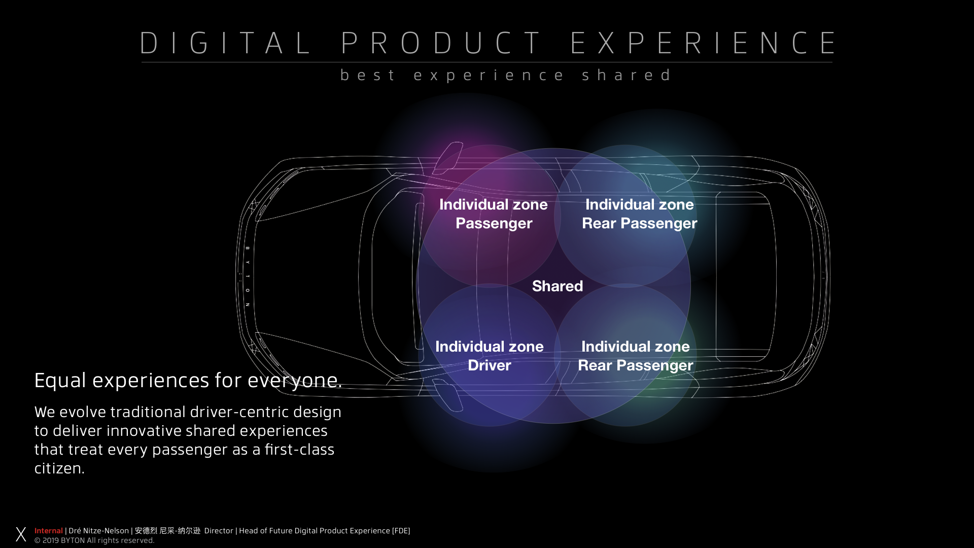
Observing our testing and studies, users appreciate that we design based on common sense. The intuitive system is easy and fun to use since it resembles the interaction models they’ve learned from using their cell phones, their remote controls and their laptops.
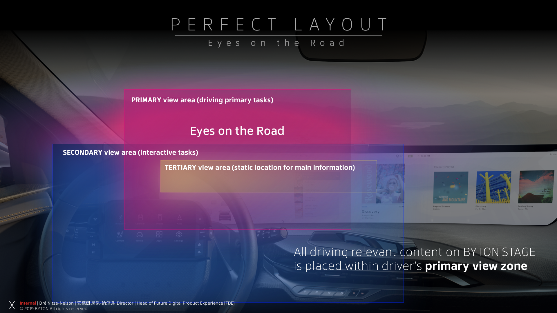
Three ingredients: Predictable behavioral patterns, muscle memory and content hierarchy.
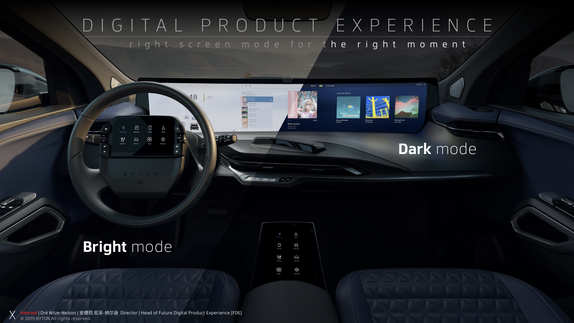
In contrast to many other automotive HMIs, 48 inches is some serious digital real-estate. The benefit is user readability. Suddenly it’s very easy to read street names and POI on our map experience. We have enough surface to structure content in a meaningful way. I call it Context Sensitive Content Distribution based on the principle “Less is More”. While in drive mode, we don't display more content as other cars. The 48 inch surface allows my design team to structure the content much better than in any other cars. Now, the content has room to unfold, font sizes can be big enough to read on bumpy roads and all relevant safety information and warnings can be placed contextually. Users can change the font size similarly to their phone. Our Dark- and Bright Mode and (auto/manual) adjustable brightness of all screens avoids "light smog". The beauty about displays is that we can turn them on when needed, and turn off when not in use. We also can dim all input screens or put them in idle mode.
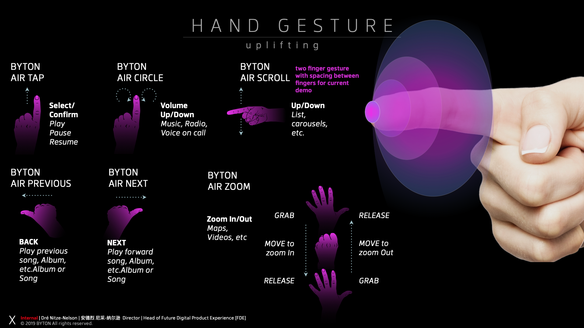
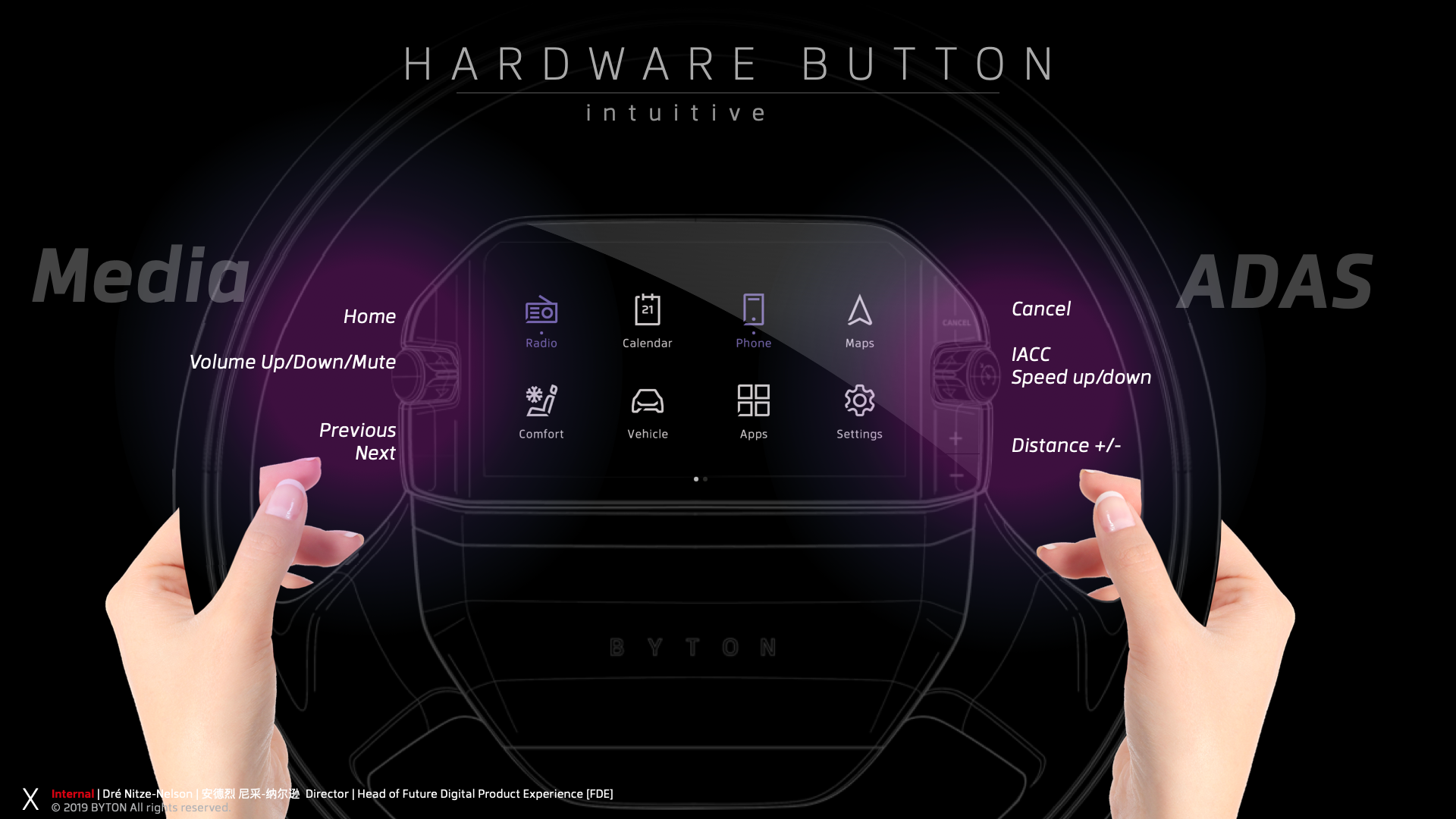

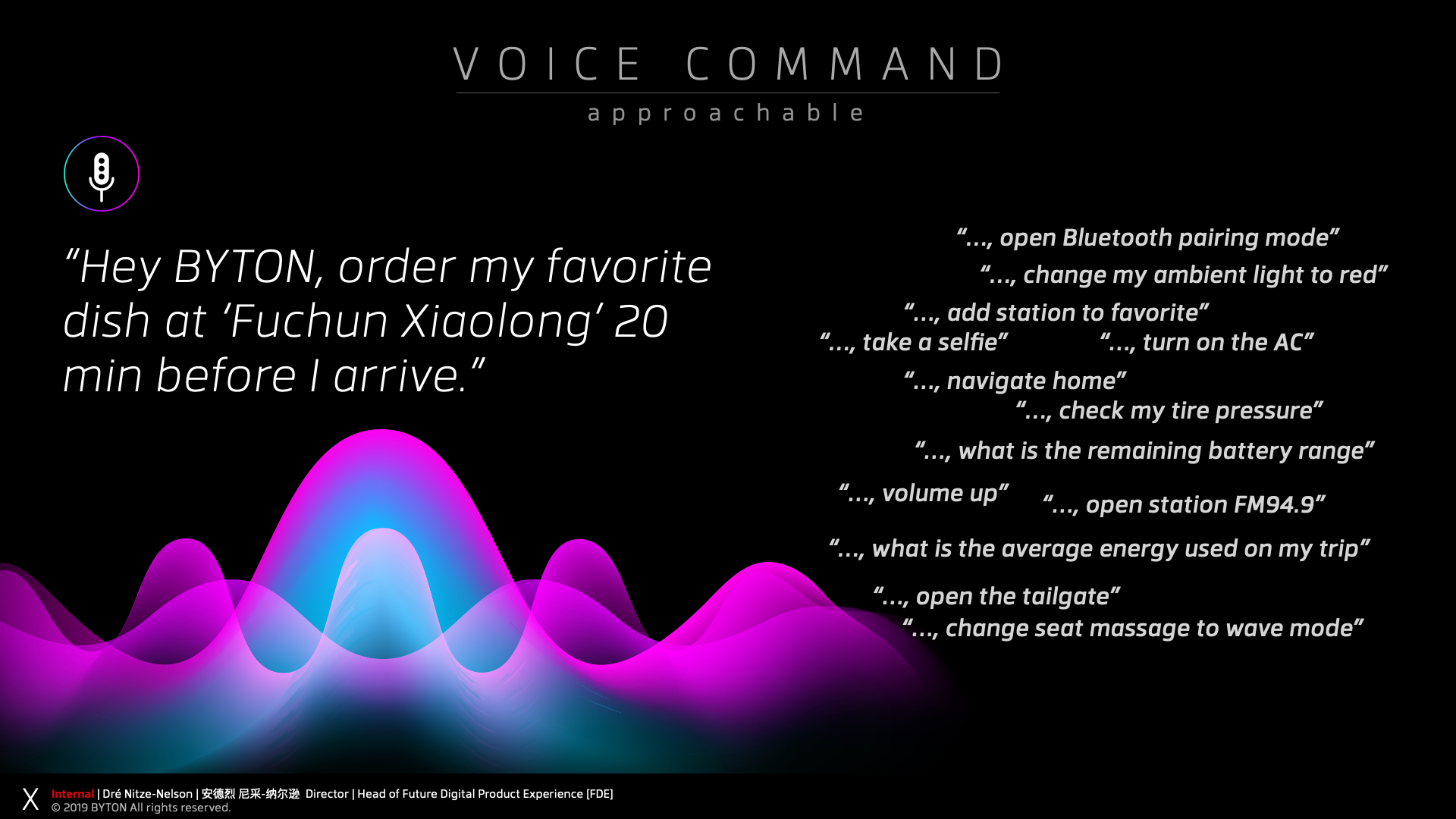
The entire industry is gravitating toward bigger screens, not only in the car, but on our cell phones and computer displays. The additional digital space makes it easier for the users to consume content, read, watch and work. But there’s more to it. Anticipatory design is intended to reduce users’ cognitive load by making decisions on their behalf. Having too many choices often results in decision paralysis, a state in which a user cannot decide. In such a scenario, a predictive engine optimize the hierarchy of contents based on predictor variables, helping the user make a decision. By introducing a holistic global timeout we make the system predictable. A holistic global timeout allows the user to establish a Byton-specific mental model. For instance, lists, overlays, and other UI elements will auto dismiss after a certain amount of time when not in use. The timing is currently 6 seconds and is subject to iteration.
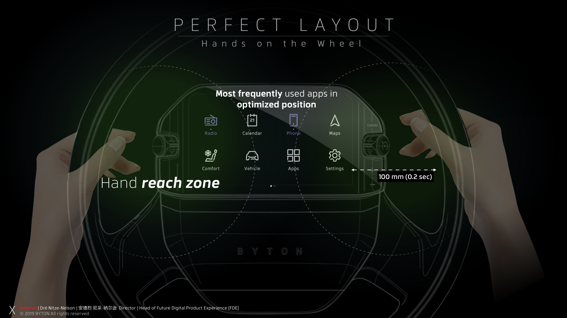
After the global dismiss time, all open apps enter the decluttered ‘hero’ state. In the ‘hero state’ the content in ‘focus’ is either centered, augmented, or magnified. For instance, in the media application, the song currently playing will switch to hero state after the global timeout. In this case, the playlist will be hidden and the cover artwork or radio station logo will be centered. This declutters the screen, minimizes distraction and highlights the selected content. To exit hero state, the user needs to interact with the application/feature via voice, touch, hand gesture or gaze.
What truly fascinates me when driving our car is you simply don’t notice the Byton stage anymore. It becomes like digital paper. The content is easy to read.
Using driver monitoting cameras as additional input for interaction models.
DYNAMIC SCREEN BRIGHTNESS: OPTIMIZED WITH PUPIL TRACKING
Driver monitoring cameras primarily serve as a tool for detecting driver fatigue. However, by tracking the driver's pupils, we can unlock new possibilities for safety-oriented user experience design. Pupil tracking allows us to understand the driver's focus and adjust features accordingly.
For example, when the driver looks at the screen, the system can automatically increase the screen brightness for better visibility. Conversely, when the driver's focus shifts back to the road, the screen brightness can be decreased to minimize distractions. This dynamic screen brightness optimization ensures an enhanced and safer driving experience.
DYNAMIC SPACE MANAGEMENT: ENHANCED WITH PUPIL TRACKING
We can achieve even more with pupil tracking technology. While working at Byton, I designed the massive 48-inch screen to be visually divided into three distinct areas. Area one displayed crucial driving information, such as speed, while areas two and three were reserved for infotainment content like maps and media.
By integrating pupil tracking, I enabled dynamic expansion of each area based on the driver's focus. This approach allowed me, as a designer, to fully utilize the available screen real estate and elegantly unfold content in a way that adapts to the driver's needs, ultimately enhancing both the visual experience and overall functionality.
DECLUTTER - STAGE MANAGEMENT: ENHANCED USER EXPERIENCE
With the "in-focus" area expansion, content unfolds, and its menu appears, allowing users to interact with the focused application seamlessly. This feature is particularly beneficial for universal HMIs, as it provides context and simplifies user understanding. To declutter the UI effectively, I introduced a "Stage Management" system, which required a thorough understanding of users' perceptions of tasks. We conducted user studies to gain insight and refine our approach.
Now, when a task is fulfilled, I present what I call a "Hero State." For example, when a user focuses on a particular screen area, the area expands, and the application within it unfolds to display a menu. The user can then scroll and select options. This interaction is considered a task. I implemented a global timeout to fade out the menu once the task is completed, decluttering the UI and leaving only the selected content displayed. Thus, the "Hero State" is brought to life, elevating the overall user experience!
CONTROL CONTENT: MINIMIZING DISTRACTION
At Byton, I was tasked with finding a way to display a movie while driving without distracting the driver. I utilized the driver monitoring cameras and pupil tracking capabilities to hide or stop a video being displayed. When the driver's pupils moved towards the third area on the screen, where the movie was playing, I either stopped the movie or hid the video. Technically, this solution worked well, but it's uncertain whether this feature provided a safe and desirable experience for the driver.
As I experimented with pupil tracking to explore the extent to which users could interact with displayed content, I began to fuse a variety of other inputs to enhance the overall user experience. More about this innovative approach and its applications will be discussed in the next chapter.
Fuse multiple inputs for intutitive interaction.
Fusion: Pupil tracking and hand gesture recognition.
In my pursuit to create an intuitive interaction with minimal cognitive load and maximum desirability, I fused pupil tracking with our hand gesture algorithm. My approach involved using the same interaction model for touch and applying it to the application within the focused area. When the driver looks at a specific area on the screen, the area expands, the context menu unfolds, and interaction is made convenient via hand gestures. No new gestures needed to be learned, and the UI provided immediate, easily recognizable feedback. The user could scroll through a list and select items in the same way as on our touch displays. A consistent design system helped reduce cognitive load and made the system enjoyable to use.
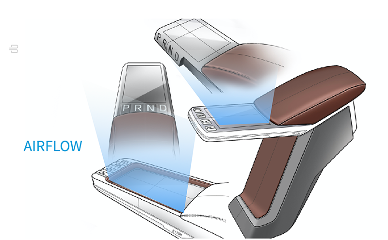
To ensure even safer use of our hand gesture controller, I incorporated an airflow around the center console to better indicate the hand gesture camera's sweet spot. The airflow started and stopped the moment the camera recognized a hand and its movement. This allowed the driver to position their hand within the camera's detection zone without looking, as the airflow was strong enough to be felt when the hand was optimally placed. This innovative combination of technologies enhanced both user experience and safety.
 The driver, looking at a specific area on the screen, can see the area expending, the context menu unfolding and interact conveniently by hand gesture. No new gesture needed to be leaned. The UI responded imminently to provide easy recognizable feedback. The user was able to scroll a list and to select a list item the same way like on the our touch displays. A consistent design system helped to lower the cognitive load and made it easy and fun to use our system.
To provide an even safer way to use our hand gesture controller, I added an airflow around the center console to better indicate where the hand gesture camera’s sweet spot it.The airflow started and stoped at the moment the camera recognized a hand and its movement. The driver could now place the hand within the camera cone without looking at it as the airflow was strong enough to feel when the hand was in the optimal position.
Fuse multiple inputs to skip the awake word.
Fusion: Pupil tracking and voice commands.
Fusing pupil tracking with our hand gesture algorithm worked out great. Our tests and studies showed that users have been easy able to understand interaction model. It turned out that they loved to use it.
My next step was fuse the new gaze and hangggsture fusion with voice commands. My idea was to design an interaction model which allows the user to fulfill a task by switching between the input methods anytime.
For instance: the user began to interact with our system by using hand gesture but should be able to finish the task via voice command.
Our pupil tracking feature provided an understanding in which area the drive is looking at. Either on the road or at one of our three areas at the screen. With that, we had enough context to skip the awake word for voice commands.
In more detail: The application within the “in-focus” areas unfolded it’s menu. The user can now continue to use the system by either hand gesture or voice to interact. Voice commands such as NEXT, DOWN, UP, PLAY PAUSE or even CLOSE were possible to process.
In this case my interaction model worked without using any awake word because of the stage manager which was listing to possible voice commands or able to respond to hang gestures in context to the active application on that area in-focus.
Fuse multiple inputs for safer operation.
Fusion: Pupil tracking and steering
One of my biggest soft concerns of our 48’ shared expense display was the enormous blindspot on the A-pillar passenger side. This become especially for right turns a very difficult safety issue.
My approach was to use ADAS camera live streams to create a “see through” feature. I was simply speaking trying to make the right side of the screen transparent. I combined a few already implemented fusion capabilities and added more contextual inputs such as steering angle and speed. My goal was to cover a few edge case we have identified: sharp right turn in low speed - either forward parking, right turns in tight streets or entering a drive way.
A lower speed threshold and steering wheel angel,
combined with gaze tracking seemed to be the right approach.
When lower speed, right turn signal on and a certain steering angle to the right combined with pupils detected on the right side of the street,
we displayed the forward facing ADAS camera stream on the third area of the 48' shared experience display.
Various screens size to optimze in-vehcile experince.

Best and safest experience for manual driving and not driving or L4/5 use cases.
Bigger screens are great for many reasons, especially for entertainment use cases. But how can we design the best experience in combination with safety while manually operating the vehicle and watching a movie while in park or charing?
My approach was to change to size of the screen by moving it or out of the IP. When in Drive, the display will be extend enough to provide the optimal real-estate to display all relevant driver related information. This will be done in a safe fashion as the screen will not block the view of the driver. When the vehicle is in Park, the display can extend further to increase the surface size to provide an optimal entertainment experience.
Things can be simple - sometimes.